

The Ultimate Guide to Data Analytics for Beginners: From “Should I Learn This?” to Your First Project
Is Data Analytics Actually Worth It in 2026?
Let’s be honest—you’ve probably heard the hype. “Data analytics is the future.” “Every company needs data people.” “You can make six figures.”
But here’s what nobody tells you: most people quit before they start because they’re chasing the outcome instead of understanding the journey.
This guide isn’t about getting you hyped. It’s about giving you the roadmap, the reality check, and the exact next steps to actually become a data analyst—without the overwhelm.
The Real Talk: What You’re Actually Signing Up For
Job Market Reality: Yes, there’s demand. But it’s not “learn Python and get hired” anymore. Companies want people who can:
- Ask the right questions
- Clean messy data without complaining
- Communicate findings to non-technical stakeholders
- Actually solve business problems (not just make pretty dashboards)
About Imposter Syndrome: You will feel like a fraud at some point. Everyone does. The non-linear learning path is completely normal—you’ll jump between SQL, Excel, and BI tools, and that’s exactly how it should be.
The Good News: If you’re willing to build real projects and document your process, you’ll stand out from 90% of other junior applicants.
The Beginner’s Roadmap: The Three Essential Skills (And Why They Matter)
Here’s the framework thousands of beginners try to skip—don’t be one of them.
If you want a single, structured course to follow alongside this roadmap, Alex The Analyst’s free Data Analytics Bootcamp on YouTube covers all the fundamentals below — Excel, SQL, Power BI, Python, and Pandas — plus the parts most guides skip: building a resume, practicing for technical interviews, the basics of Azure and AWS, and how to actually use LinkedIn to land a job. Use it as your “how,” and use this guide’s project-first approach as your “what to do with it.”
1. Excel: The Foundation Nobody Wants to Admit They Need
Before you touch SQL or Power BI, you need Excel. Not for clicking around—for thinking in data.
What you actually need to know:
- Pivot Tables (your most powerful tool for 80% of analysis tasks)
- VLOOKUP, INDEX/MATCH, and basic formulas
- Data cleaning fundamentals (trim, find & replace, removing duplicates)
- Creating simple visualizations
Why it matters: Excel is where 40% of businesses still run their data. More importantly, it teaches you how to think about data structure, relationships, and aggregations. This mindset transfers directly to SQL and BI tools.
2. SQL: The Language That Unlocks Everything
SQL is the “universal translator” of data. Every job uses it. Every company needs it.
What you actually need to know:
- SELECT, WHERE, and ORDER BY (the basics—master these first)
- JOIN (inner, left, right)—this single concept unlocks 70% of real-world queries
- GROUP BY and aggregation functions (COUNT, SUM, AVG)
- Basic filtering and conditional logic
Why it matters: SQL lets you ask questions of massive datasets instantly. It’s the skill that makes you independently dangerous—you don’t need anyone to give you data anymore.
Trying to learn “advanced SQL” before mastering JOINs. Stop. Master the fundamentals first.
Once the fundamentals click, put them into practice with these SQL projects for beginners — real queries, real messy data, real business questions.
3. BI Tools (Power BI or Tableau): Making Data Visible
After SQL, you need to visualize. This is where dashboards live.
What you actually need to know:
- Data modeling (relationships between tables matter more than pretty charts)
- Basic visualizations (bar, line, pie—don’t overthink it)
- Filters and slicing data for different stakeholders
- How to avoid misleading visualizations
Why it matters: Dashboards are how non-technical people consume data. If you can build a clear, honest dashboard, you become invaluable.
Stop focusing on colors and animations. Focus on clarity. A gray bar chart that answers the question beats a neon dashboard that confuses people.
The Optional (But Growing) Layer: Python/R
Should you learn Python right now? No. Not yet.
Learn Python after you’ve built 2-3 projects with Excel, SQL, and a BI tool. Here’s why:
- 80% of junior analyst jobs don’t require Python
- You’ll appreciate Python much more once you hit the limitations of SQL
- You’ll know when you need it instead of learning it “just in case”
Hands-On Learning: The Project Blueprint
This is the section that separates people who think they’re analysts from people who are analysts.
Step 1: Define a Business Problem First
The Mistake Everyone Makes: Starting with the data.
You find a cool dataset on Kaggle. You download it. You start exploring. Three days later, you have 50 charts and no idea what you’re trying to prove.
The Right Approach: Start with the question, find the data that answers it.
How to Define a Real Business Problem
A good business problem has these characteristics:
- It’s specific – Not “analyze customer data” but “What causes high-value customers to churn?”
- It’s answerable – You can realistically find data to address it
- It matters to someone – The CEO, marketing manager, or product team actually cares about the answer
Real Examples (And Why They Work)
Example 1: “What drives customer churn?”
- Why it works: Every company cares about retention
- Data you’ll need: Customer behavior, subscription/purchase history, support interactions
- Impact: Identifying at-risk customers could save thousands in revenue
- Portfolio value: Shows you can do segmentation analysis + predictive thinking
Example 2: “Which product categories are trending?”
- Why it works: Product teams need to know what to invest in
- Data you’ll need: Sales data by category, time period, maybe competitor data
- Impact: Justifies budget allocation decisions
- Portfolio value: Shows trend analysis, time-series thinking, and business acumen
Example 3: “How does marketing spend correlate with sales?”
- Why it works: Marketing directors live and die by ROI
- Data you’ll need: Marketing spend by channel, sales by channel, time periods
- Impact: Guides budget decisions between channels
- Portfolio value: Shows correlation analysis, causation thinking, and critical thinking
These are questions businesses ask, not questions data analysts think are interesting.
Step 2: Exploratory Data Analysis (EDA) Workflow
Here’s the hard truth: 80% of your time as a data analyst is spent here. Not building dashboards. Not writing elegant SQL. Data cleaning and exploration.
The EDA workflow is iterative. You don’t go through it once. You go through it multiple times, and each loop teaches you something new.
Phase 1: Cleaning (The Unsexy Part That Matters Most)
What “cleaning” actually means:
- Removing or handling duplicates (you might have the same customer 3 times)
- Handling missing values (some customers have no email recorded)
- Standardizing formats (some dates are MM/DD/YYYY, others are DD-MM-YY)
- Removing outliers or invalid data (ages that are 150 years old)
- Fixing typos in categorical data (some categories say “New York”, others say “NY”)
Common issues you’ll face:
- “This dataset has 10,000 rows but 2,000 are duplicates”
- “Half the customers have blank email addresses—do I include them?”
- “One customer’s ‘annual revenue’ is $999 billion—is that a typo or real?”
Document your cleaning decisions. “I removed 200 rows where age > 120 because these are likely data entry errors” is more valuable to future you (and employers) than just silently deleting them.
Phase 2: Aggregating (Where Patterns Emerge)
What “aggregating” means:
- Grouping data by relevant dimensions (by product, by month, by customer segment)
- Calculating metrics (total sales, average customer age, conversion rate)
- Creating new variables that tell the story (customer lifetime value, churn rate)
Real examples of aggregation:
- “Group by product category, sum the revenue” → Which categories make the most money?
- “Group by month, count new customers” → Is customer acquisition growing?
- “Group by customer segment, calculate average order value” → Which segments spend more?
Why this matters: Aggregating reveals patterns that raw data can’t show you. One customer’s behavior is noise. 10,000 customers’ average behavior is signal.
Common pitfalls:
- Aggregating at the wrong level (“total across all time” hides seasonal trends)
- Forgetting to handle edge cases (“what if a customer has no purchases?”)
- Creating misleading aggregations (“average revenue” is useless without knowing the median, min, max)
Phase 3: Visualizing (Telling the Story)
The goal: Let the data speak without needing you to explain it.
A good visualization makes the insight obvious. If someone needs you to explain your chart, your chart isn’t good enough.
Types of visualizations at this stage (keep it simple):
- Bar charts – Comparing categories (which product made the most?)
- Line charts – Showing trends over time (is revenue growing?)
- Scatter plots – Showing relationships (does more marketing spend = more sales?)
- Pie charts – Showing composition (what % of sales is from each category?)
What you’re NOT doing yet: Making it pretty. Making it interactive. This phase is about discovery, not presentation.
Common mistakes:
- Using too many colors (makes it confusing)
- Choosing the wrong chart type (pie chart for 10 categories is unreadable)
- Adding unnecessary 3D effects or animations (distraction, not clarity)
- Missing axis labels or titles (viewers don’t know what they’re looking at)
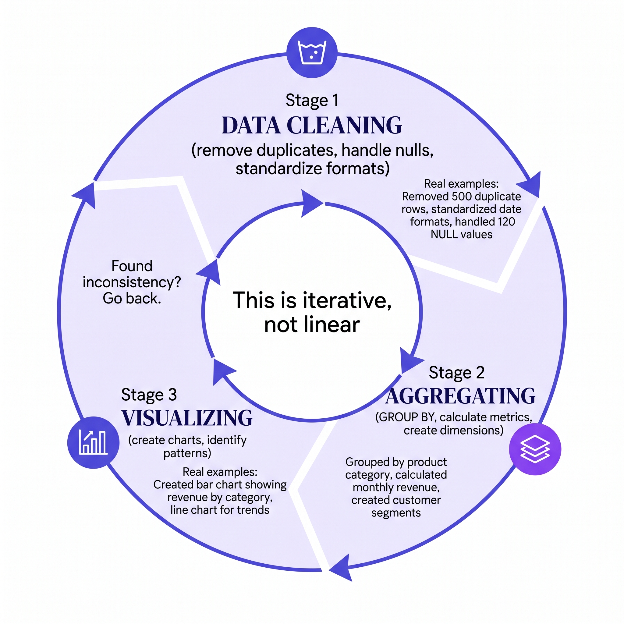
The EDA workflow is iterative—you’ll loop through these phases multiple times.
Step 3: Build Your First Project
The right scope: This is crucial. Too big and you’ll quit. Too small and you won’t learn anything.
The Sweet Spot:
- One dataset (not merging 5 sources)
- One clear business question (not “analyze this data”)
- 2-3 weeks of work (not 2 months, not 2 days)
- A question YOU care about (not a tutorial project)
Project Ideas to Start With:
- Personal finance: Analyze your own spending data (CSV export from your bank)
- Sports data: Pick your favorite sport, analyze player performance
- Social media: Download your own data, analyze posting patterns
- Job market: Analyze job postings for your target role
- Local data: City census data, local business data, housing prices
The best first project uses data you have easy access to and a question that actually matters to you.
Need a dataset to start with? Maven Analytics’ Data Playground is a great free source — real, business-relevant datasets (sales, HR, marketing, and more) that come with enough messiness to give you genuine cleaning and analysis practice, without the hit-or-miss quality you sometimes get scraping random Kaggle uploads.
Step 4: Document Everything
This is where you’ll stand out from 90% of other junior analysts.
Most people create a chart and call it done. You’re going to tell the story behind the analysis.
What to Document
1. The Question You Asked
“I wanted to know: Does customers who receive support within 24 hours have lower churn rates?”
2. Your Hypothesis (Your Prediction)
“I predicted that customers receiving quick support would have 15-20% lower churn, because responsiveness shows we care.”
3. The Data You Used
“I used 6 months of customer support ticket data (2,150 total customers, 450 churned) with response time and 12-month churn status.”
4. Your Cleaning Process
“I removed 50 duplicate records and 30 records with missing support response times. I standardized response times to hours.”
5. Your Key Findings
“Customers with <24hr support response had 8% churn. Customers with >48hr response had 22% churn. That’s a 14 percentage point difference—significant.”
6. What Surprised You
“I expected response time to matter more. Turns out, initial contact within 24hr was the threshold. After that, each additional hour didn’t change much.”
7. What You’d Do Differently
“Next time, I’d look at multiple support touchpoints, not just the first response. Some customers had follow-up issues that weren’t resolved.”
8. Business Implications
“This suggests we should prioritize 24hr first-response SLA. The ROI would be worth it if it reduces churn by 14 percentage points.”
How to Present This
- Written: A GitHub README or blog post (this becomes portfolio content)
- Slide deck: 5-8 slides with findings
- Interactive: A dashboard you can show people
The documentation matters more than the final visualization. Employers care about your thinking, not your design skills.
Your Next Step: The 90-Day Action Plan
This is your exact roadmap. Not a suggestion. Not “when you’re ready.” A concrete, day-by-day progression.
Week 1-2: Foundation Phase (2-3 hours/day)
Goal: Get comfortable with data thinking, not master the tools.
Excel Work (1.5 hours/day):
- Day 1-3: Pivot tables basics (group data, calculate sums)
- Day 4-7: VLOOKUP, INDEX/MATCH (linking data across sheets)
- Day 8-14: Create your first analysis in a spreadsheet (take any dataset, group by categories, calculate totals)
SQL Work (1.5 hours/day):
- Day 1-3: SELECT, WHERE, ORDER BY (write 10 simple queries)
- Day 4-7: JOIN basics (understand primary/foreign keys)
- Day 8-14: Write 5 JOINs on the same dataset (repetition builds muscle memory)
What Success Looks Like:
- You can write a basic SQL query without Googling the syntax
- You’ve built one small Excel analysis with pivot tables
- You understand what WHERE and JOIN do (not just how, but why)
Week 3-4: Go Deeper Phase (3-4 hours/day)
Goal: Start thinking like a data person.
SQL Deep Dive (2 hours/day):
- Days 1-7: Master JOINs (inner, left, right) – this is THE skill
- Days 8-14: Learn GROUP BY + aggregation functions (COUNT, SUM, AVG, MAX)
- Days 15-28: Write 10 complex queries combining JOINs, GROUP BY, and filtering
Real-World Challenge: Take a business question (“What’s our revenue by product category?”) and write the exact SQL query to answer it.
Excel Analysis (1-2 hours/day):
- Build your first small analysis: Pick a dataset, ask one question, answer it with pivot tables
- Document your process (what question did you ask, what did you find?)
What Success Looks Like:
- You can write a JOIN without thinking about the syntax
- You’ve built one complete analysis (question → data → answer → insight)
- You understand why GROUP BY matters
Week 5-8: Your First Real Project (4-5 hours/day)
This is where it gets real.
Project Setup (Day 1-3):
- Pick your dataset (something you care about)
- Define your business question (specific, answerable)
- Write down your hypothesis
Data Cleaning (Week 2):
- Import the data into Excel or SQL
- Identify dirty data (duplicates, nulls, inconsistencies)
- Clean it systematically
- Document your decisions (“removed 50 rows where age > 120”)
Analysis (Week 3-4):
- Answer your business question using SQL and Excel
- Create 3-5 visualizations (bar charts, line charts, etc.)
- Calculate key metrics
Documentation (Week 4):
- Write up your process (what you found, what surprised you)
- Create a 1-page executive summary
- Write a detailed walkthrough (clean vs. messy data, your thought process, assumptions)
What Success Looks Like:
- You have a complete analysis with question → data → insight
- You can explain your process to someone non-technical
- You have something to show in job interviews
Week 9-12: Expand & Polish (5-6 hours/day)
Goal: Turn your first project into a portfolio piece that gets you noticed.
Redo in SQL (Week 1-2):
- Take your Excel analysis and rebuild it using SQL
- This teaches you when to use SQL vs. Excel (answer: SQL is faster for large datasets)
Build in Power BI/Tableau (Week 2-3):
- Create a dashboard version of your analysis
- Make it interactive (filters, drill-downs)
- Make it clear (no fancy design, just clarity)
Polish Your Documentation (Week 4):
- Write a blog post explaining your project
- Create a GitHub repo with your code/queries
- Build a slide deck you can present
Share Publicly:
- Post on LinkedIn
- Share in data communities (Reddit, Discord)
- Put in your portfolio
- Link from your personal brand site
What Success Looks Like:
- You have a portfolio project you’re proud of
- You can explain it to anyone (technical or non-technical)
- People are asking to see it
- You’ve documented enough that someone could rebuild it
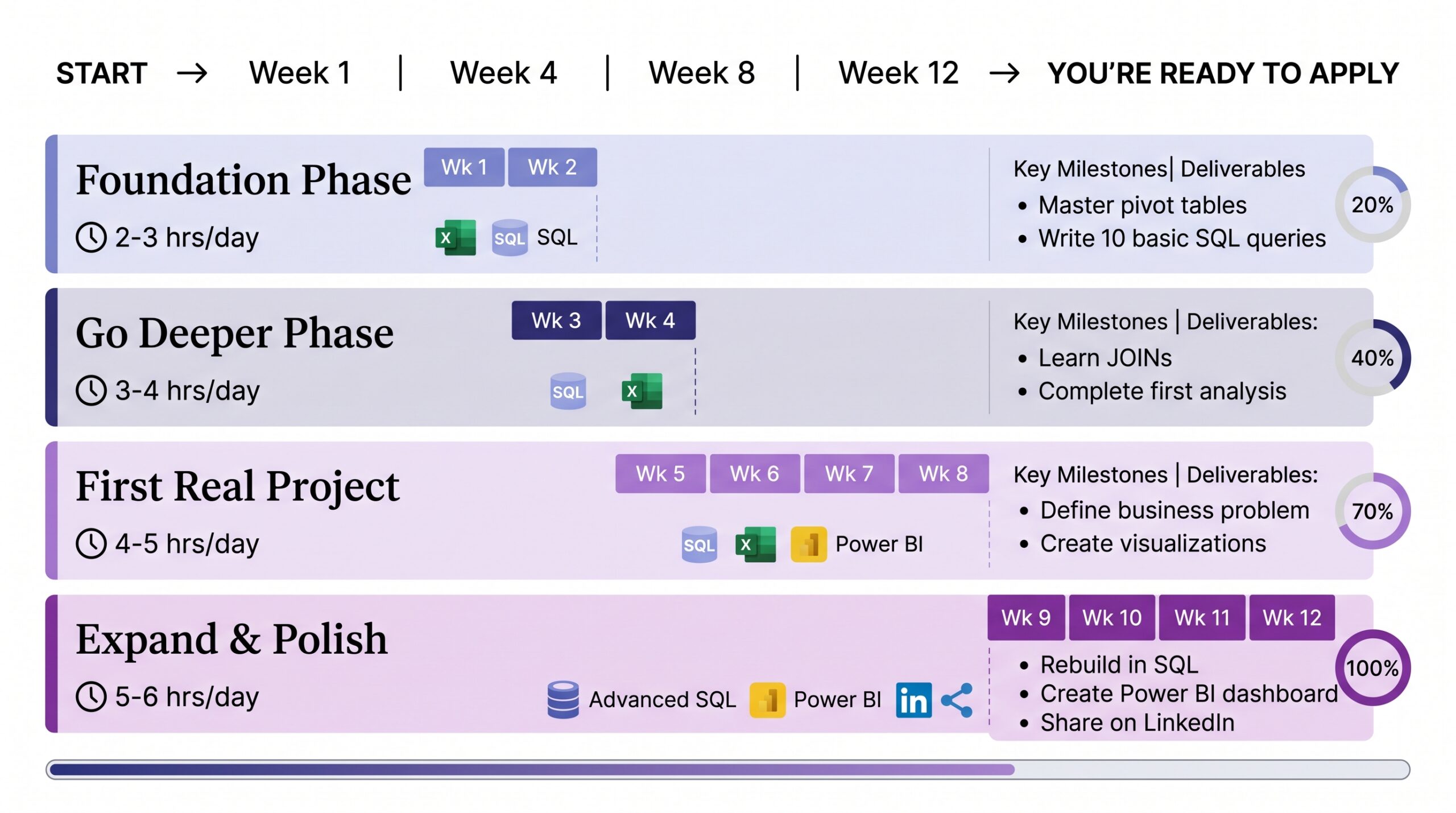
Your complete 90-day learning roadmap—realistic, achievable, and structured.
The Hidden Skills Employers Actually Pay For
Here’s what separates junior analysts who get hired from those who don’t:
1. Domain Knowledge: Industry Context Beats Tool Skills
You can teach someone Power BI in 3 months. You can’t teach them what “customer lifetime value” means in retail in 3 weeks.
What this means for beginners:
- Pick a domain you care about or know something about
- Build projects in that domain
- Learn the terminology, metrics, and business logic
- You instantly become more valuable than someone with “better SQL skills”
2. Communication: Translating Data Into Action
This is the skill that actually separates $50k analysts from $100k+ analysts.
You can find a trend. But can you explain why it matters to your CEO?
What to practice:
- Writing clear, jargon-free summaries of findings
- Creating executive summaries (1 page, no fluff)
- Presenting findings to non-technical stakeholders
- Saying “I don’t know” confidently, then finding the answer
3. Problem-Solving Frameworks: Asking the Right Questions
Good analysts ask clarifying questions before diving into data.
The framework:
- What is the business question?
- What data do we actually have?
- Are there any limitations or caveats?
- What does success look like?
This alone will make you stand out.
Frequently Asked Questions (The Stuff Everyone Wonders)
Q: Do I need a degree or certification to become a data analyst?
No. A portfolio of real projects beats a degree in 2026. That said:
- Google Data Analytics Certificate ($39, 6 months): Good for beginners, teaches Excel/SQL/visualization basics
- Meta Analytics Certificate ($39, 3 months): Shorter, more focused
- University degree: Only necessary if you want to work at highly regulated industries (finance, healthcare) or prefer job security in a corporation
Focus on building projects first. Certifications can come later.
Q: Is SQL related to Power BI? Do I need both?
Yes and yes.
- SQL = How you get data and ask questions of it
- Power BI = How you visualize and present that data
They’re complementary, not interchangeable. You need both.
Q: What are the most common beginner traps I can avoid right now?
- Learning everything at once: SQL + Python + Power BI + Tableau. Don’t. Master Excel → SQL → One BI tool in that order.
- Skipping data basics: You want to learn fancy things. But 70% of analyst work is data cleaning. Get comfortable with it.
- Building with fake tutorial datasets: Kaggle cleaned datasets feel nice, but real data is messy. Work with messy data as soon as possible.
- Not documenting your process: Your code/queries are interesting. Your thinking is valuable. Document both.
- Comparing your chapter 2 to someone else’s chapter 20: Some people took 4 years to get their first job. Some took 6 months. Both are fine.
Q: How do I find a mentor?
- Reddit & Discord: r/dataanalysis, data communities (people help for free)
- LinkedIn: Comment thoughtfully on posts from analysts you admire, build genuine connections
- Local meetups: Find data analyst meetups in your city (free, real connections)
- Twitter/X: Follow analysts sharing knowledge, engage with their content
- Your job: Ask senior analysts if they’d grab coffee and review your work
The best mentors aren’t formal. They’re people who see potential in you and want to help.
Join The Lab: Your Next Move
You now have the roadmap. Here’s what separates people who learn from people who do: Building actual projects. Not tutorials. Not Udemy courses. Real, messy projects that solve real questions.
That’s what we focus on at The Data Alchemist. We publish project walkthroughs, SQL deep-dives, and practical guides that go beyond theory.
Check out our portfolio to see what complete projects look like. Then build your own version with your own data.
Join The Lab Newsletter — weekly breakdowns of real data projects, the tools we actually use, and mistakes to avoid. No spam, just what works.
Subscribe to The Lab →And remember: Every analyst started exactly where you are right now—confused but curious. The ones who made it weren’t smarter. They just started building.
Ready? Pick a dataset. Ask one question. Build one project.
That single project is worth more than 100 completed tutorials.
Now go. 🚀