7 Things I Wish I Knew Before Learning PowerBI
PowerBI has a steep learning curve — but most of the frustration isn’t about the tool. It’s about starting in the wrong order.
A Reddit post in r/PowerBI put it well: “I spent two weeks learning DAX before realising I didn’t understand data models at all.” It got 662 upvotes — because almost everyone who’s learned PowerBI has a version of that same story.
PowerBI looks approachable. Drag a field onto a canvas, a chart appears. It feels easy right up until it doesn’t — and then it feels impossible. The jump from “I made a bar chart” to “I built a dashboard that actually answers a business question” is bigger than the tool lets on.
Here’s what I wish I’d known before I started.
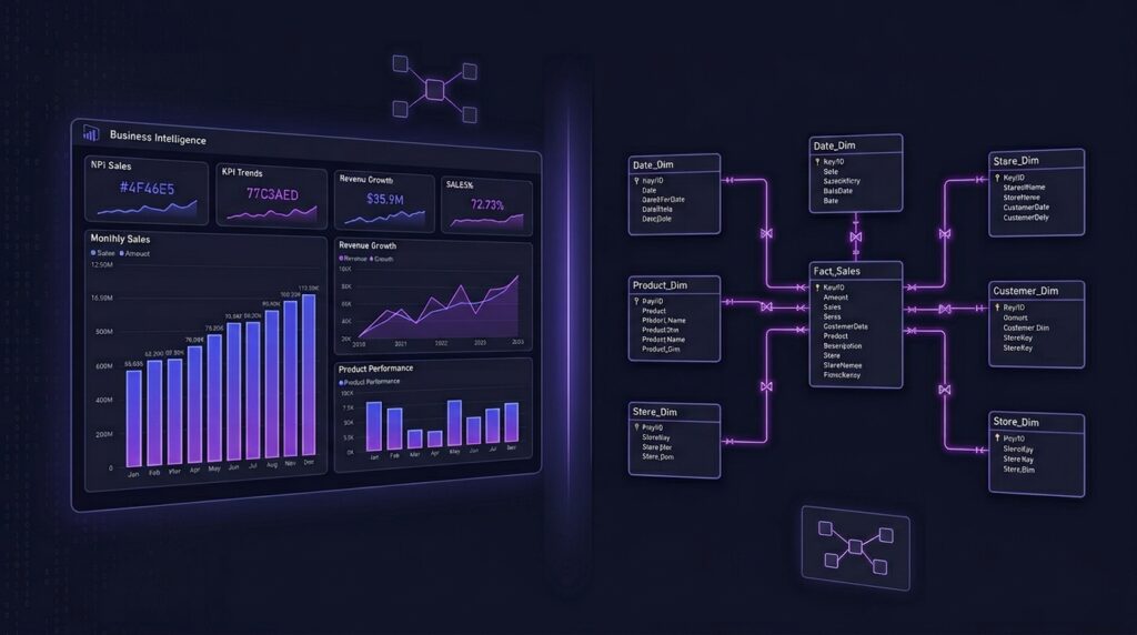
This is the one. If you skip understanding how tables relate to each other — what a fact table is, what a dimension table is, how relationships work — DAX will feel like black magic.
PowerBI is essentially a layer on top of a database engine (Vertipaq). Everything — every measure, every visual, every filter — is filtered through the data model. If your model is wrong, no amount of clever DAX will save you.
Before writing a single DAX formula, spend time in the Model view. Understand your tables, set up relationships correctly, and know the difference between a one-to-many and many-to-many relationship. Everything else builds on this.
This confuses almost every beginner. Both use DAX. Both live in your table. But they work completely differently — and using the wrong one will silently break your report.
Computed row by row at data refresh. Stored in the model. Bloats file size. Use only when you need a value per row.
Computed dynamically based on filter context. Not stored. Responds to slicers and visuals. Use for aggregations like totals, averages, ratios.
If it’s a calculation you’d put in a visual (SUM, AVERAGE, % of total) — it’s a measure. If it’s a new column you’d want to filter or slice by — it’s a calculated column. When in doubt, use a measure.
If DAX has a single most important function, it’s CALCULATE. It does one thing: it evaluates an expression in a modified filter context. That sounds abstract — but it’s how you answer almost every “compare against” or “override a filter” business question.
Want to show total sales next to sales for a specific region? CALCULATE. Want a running total that ignores the date slicer? CALCULATE. Want to show last year’s revenue alongside this year’s? CALCULATE with a time intelligence function inside it.
CALCULATE([Measure], Filter) — once you understand that CALCULATE changes the filter context for whatever expression is inside it, most DAX starts to make sense.
PowerBI has two places to transform data: Power Query (before it loads) and DAX (after it loads). Beginners often try to fix messy data using calculated columns — which works, but it’s the wrong tool.
Power Query is designed for data cleaning. Removing nulls, splitting columns, changing data types, merging tables, unpivoting — all of this belongs in Power Query. If you do it in DAX instead, your model gets bloated and harder to maintain.
Using a calculated column to replace null values with zero instead of handling it in Power Query during data load. Do it once at source, not repeatedly in the model.
If your report involves any time-based analysis — month over month, year to date, same period last year — you need a proper Date table. Not the date column sitting in your transactions table. A dedicated, continuous Date table that covers every date in your data range.
PowerBI’s built-in time intelligence functions (TOTALYTD, SAMEPERIODLASTYEAR, DATEADD) only work reliably when you have a marked Date table with no gaps.
Create a Date table in Power Query using List.Dates() or use DAX’s CALENDARAUTO(). Mark it as a Date table in the Model view. Do this for every report — it saves hours of debugging later.
The hardest conceptual leap in PowerBI is understanding filter context vs row context. It’s the reason a measure that works perfectly in one visual produces wrong results when you move it to another.
Filter context is the set of filters applied to a visual by slicers, rows, columns, and report-level filters. Row context is the current row being evaluated in a calculated column or iterator function. They interact in non-obvious ways — and CALCULATE is what switches between them.
Don’t expect this to click immediately. It’s the one concept in PowerBI that genuinely takes time — but once it does, everything makes sense at once.
Build a small test report and deliberately try to break your measures by changing the visual context. When you understand why it breaks, you’ll understand filter context.
The most common beginner PowerBI dashboard has every chart possible on one page and tries to show everything. It impresses nobody — not the person who built it, and definitely not the person who has to use it.
The best dashboards answer one question per page. They have a clear hierarchy: the most important number at the top, supporting context below, and detail on demand. Before opening PowerBI, write down the business question you’re trying to answer. Then build only what answers that question.
“I have sales, margin, quantity, region, category data — let me put it all on the dashboard.”
“The business question is: which regions are underperforming vs target? Build only what answers that.”
The Order That Actually Works
If I were starting PowerBI again, here’s the sequence I’d follow:
- Data modelling concepts — understand star schemas, fact/dimension tables, relationships.
- Power Query — learn to clean and transform data before it loads.
- Basic DAX — SUM, CALCULATE, FILTER, basic time intelligence.
- Visuals and design — only after the model and measures are solid.
Most tutorials start with visuals because they’re the most satisfying part. But the visuals are the last 20% of the work. The 80% that makes a dashboard actually correct and useful is the model, the query, and the measures underneath.
Start there. The bar charts will still be there when you’re ready for them.
I’ll be building PowerBI dashboards for all three of my SQL projects as a dedicated post once I complete the PowerBI course. Check back — or subscribe below to get notified when it’s live.